Selected work from my data science coursework and personal projects.
Anatomy of a Championship: Analyzing LAFC's 2022 Season
Using R and ggplot2 to dissect all 37 matches of LAFC's 2022 MLS Cup
and Supporters' Shield-winning season – with expected goals (xG) data
revealing what the box scores don't.
Overview
For my third portfolio project I wanted to work with a topic I actually
care about: LAFC's 2022 season, when they won both the Supporters' Shield
(best regular season record) and the MLS Cup in the same year. Using
American Soccer Analysis's public xG dataset covering all 489 MLS matches
from that season, I filtered to LAFC's 37 matches (34 regular season + 3
playoffs) and built four visualizations examining what actually happened —
separating what fans remember from what the data says.
Tools: R (tidyverse, ggplot2), RStudio
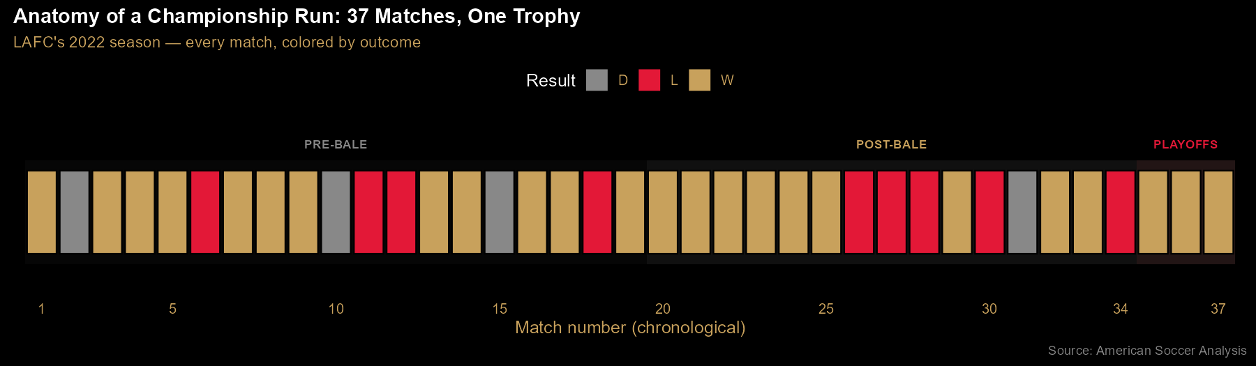
Finding 1: 37 matches, one trophy — the season in one strip
Every LAFC match of 2022, in chronological order, colored by outcome —
gold for wins, gray for draws, red for losses. The three phases are marked:
pre-Bale (before Gareth Bale's July 17 debut), post-Bale, and playoffs.
The visual tells a story about consistency: losses cluster into brief slumps
rather than spreading evenly, and the playoff run closes out three straight
wins. Notably, LAFC was already dominant before Bale arrived — this timeline is
one of the ways the "Bale saved the season" narrative meets the data.
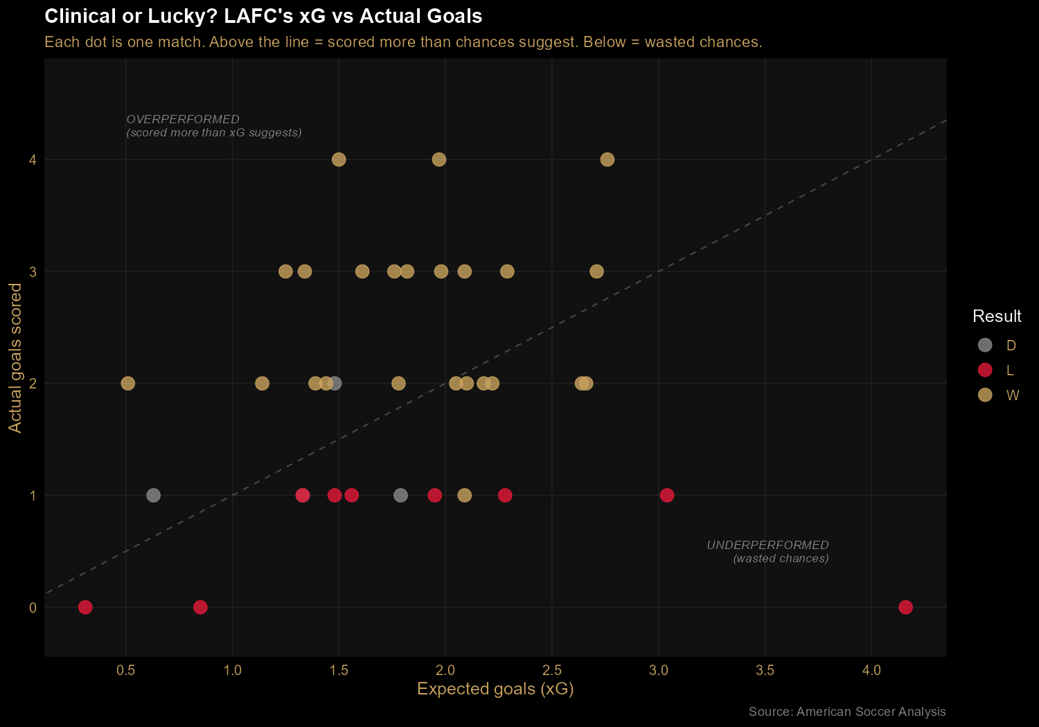
Finding 2: Clinical, not lucky — LAFC out-scored their expected goals
Plotting each match's actual goals against its expected goals (xG) reveals
whether LAFC was scoring at the rate their chance creation warranted.
The diagonal line represents "scored exactly as many goals as chances
suggest." Most gold (winning) dots sit above the line — meaning
LAFC converted chances at above-average rates when it mattered. The
bottom-right outlier at 4.16 xG and 0 goals scored is the Nashville match
on October 9: LAFC created enormous chances, converted none, and lost 0-1.
Their two other losses with the highest xG figures tell the same story —
the games they lost were often games they created plenty in but couldn't
finish.
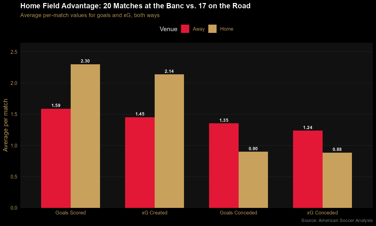
Finding 3: Home was a fortress; the road was merely fine
The home/away split reveals something dramatic. At Banc of California
Stadium, LAFC averaged 2.30 goals for and 0.90 against — a +1.40 goal
differential per match. On the road, those same numbers dropped to 1.59
and 1.35, for a modest +0.24 goal differential. The xG figures confirm this
isn't just finishing luck: they generated ~48% more chances at home and
conceded ~30% fewer. This is consistent with LAFC's reputation for a
hostile home environment, driven in large part by the 3252 supporters
group — the standing-only, 3,252-seat section behind the north goal (a
number that also adds to 12, the "twelfth man"). And the practical
implication: winning the Supporters' Shield secured LAFC home-field
advantage throughout the playoffs. The trophy wasn't just symbolic —
it was structural.
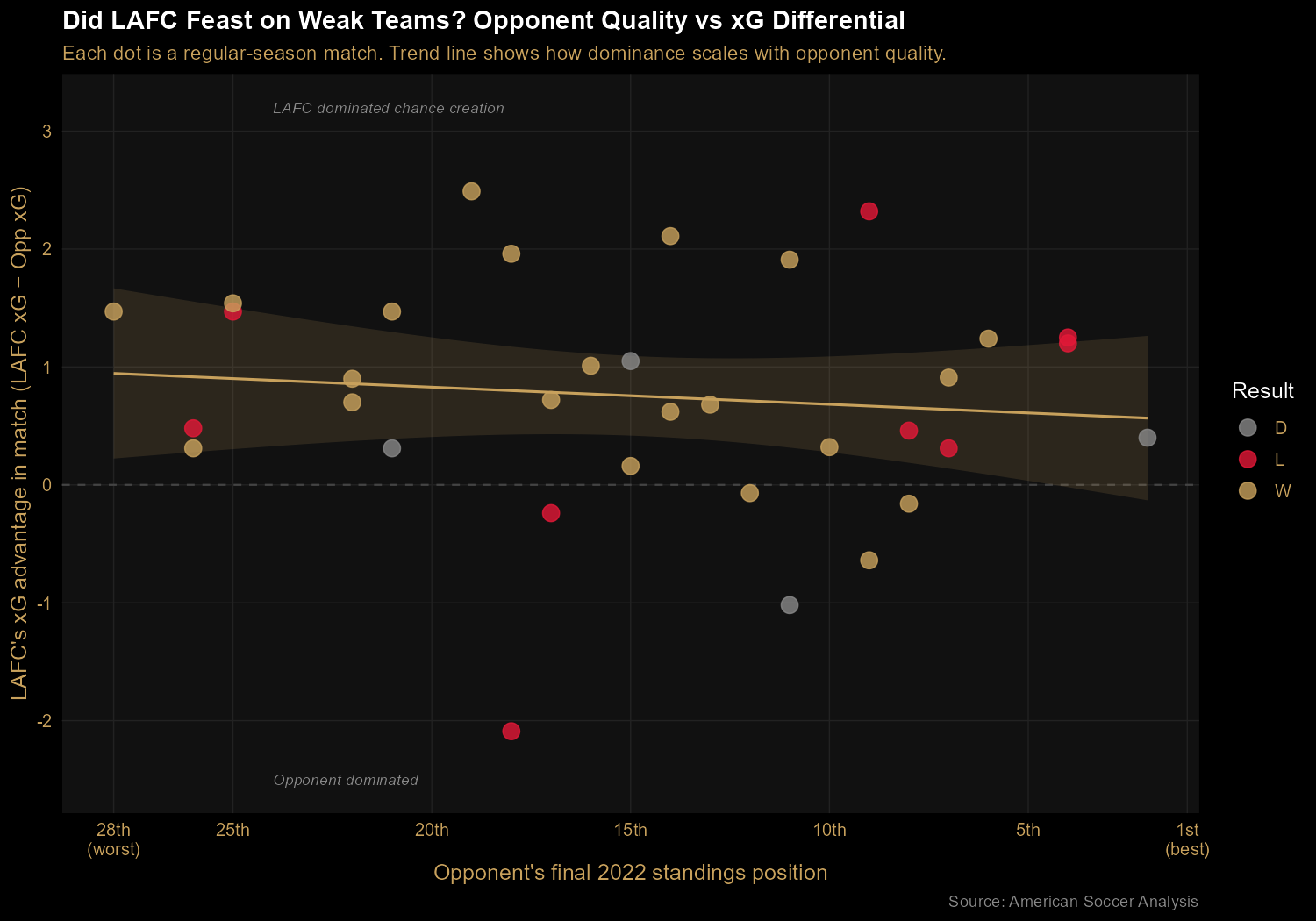
Finding 4: A real champion's profile — consistent against everyone
To test whether LAFC's dominance came from feasting on weak teams or
from genuinely being better than everyone, I plotted their xG
differential in each regular-season match against the opponent's final
league position. If they were padding their record, we'd see a steep
negative slope (big margins against weak teams, small margins against
strong teams). Instead, the trend line is nearly flat: xG advantage of about 0.95 against the bottom of the table, dropping only to about 0.55 against the top. This is a consistency profile — they weren't inflated by beating up on bad teams; they were solidly above their opponents no matter who they faced.
The Code
The rawest work in this project was in the data transformation. The public MLS dataset arrives with matches recorded from the home team's perspective — but for a team-focused analysis, every stat needs to be rewritten from LAFC's perspective. That means for each match, checking whether LAFC was home or away and swapping the goals/xG columns accordingly. The tidyverse's if_else() makes this clean:
ggplot2 made the "opponent quality" chart particularly satisfying — a scatter plot with a regression trend line, a horizontal zero-reference line, and axis reversal so that better teams appear on the right of the chart:
ggplot(chart4_data, aes(x = opponent_position, y = xg_diff, color = outcome)) +
  geom_hline(yintercept = 0, color = "#444444", linetype = "dashed") +
  geom_smooth(method = "lm", se = TRUE,
              color = "#C8A15C", fill = "#C8A15C",
              alpha = 0.15, aes(group = 1)) +
  geom_point(size = 4, alpha = 0.8) +
  scale_color_manual(values = OUTCOME_COLORS) +
  scale_x_reverse() +
  labs(
    title = "Did LAFC Feast on Weak Teams?",
    x = "Opponent's final 2022 standings position",
    y = "LAFC's xG advantage in match"
  )
Takeaways
Beyond the technical exercise of pulling apart a season's worth of xG
data, this project was a good reminder that the interesting
findings are the ones that challenge the obvious narratives.
Fans remember Bale's stunning equalizer in the MLS Cup Final; the data
says LAFC was already the best team in the league before he ever arrived.
Fans (myself included) love the atmosphere at the Banc; the data
quantifies just how much of a competitive edge it actually provides.
The 2022 season was extraordinary, but the story the data tells is subtly
different from the highlight reel — and that gap is where analysis earns
its keep.
The Sound of Genre: Visualizing Spotify's Audio DNA
Using R and ggplot2 to compare 114,000 Spotify tracks across 125 genres —
finding the audio fingerprints that make each genre sound distinct.
Overview
For my second portfolio project I wanted to work in a different language
and lean into a different strength: visualization. R's ggplot2 is
widely considered the gold standard for statistical graphics, and Spotify's
audio feature data is rich enough to tell several stories at once. Using a public
Kaggle dataset of 114,000 tracks tagged with audio metrics (danceability, energy,
valence, acousticness, and more), I produced three charts that together describe
how genre, mood, and popularity show up in the underlying data.
Tools: R (tidyverse, ggplot2), RStudio.
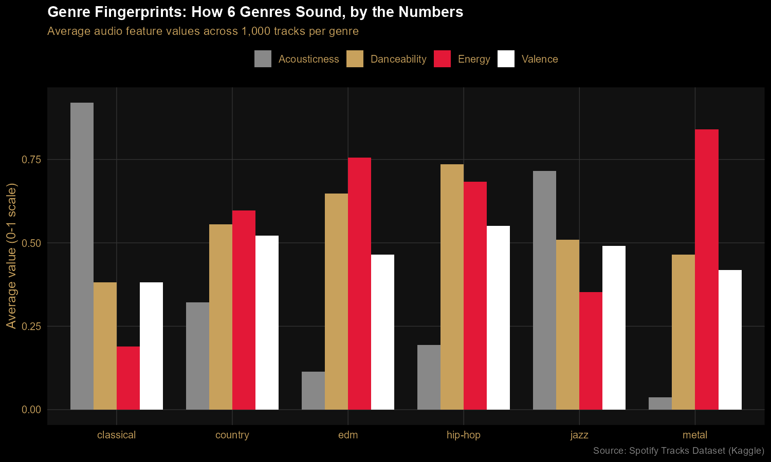
Finding 1: Every genre has a distinct audio fingerprint
Six genres, four audio features, one chart. Classical lives in a
near-pure-acoustic, low-energy bubble. Metal is the energy outlier. Hip-hop
leads on danceability. Country and jazz sit closer to the middle, blending
features in different proportions. The chart makes audible characteristics
visible — anyone reading it can match the bars to their mental model of each
genre.
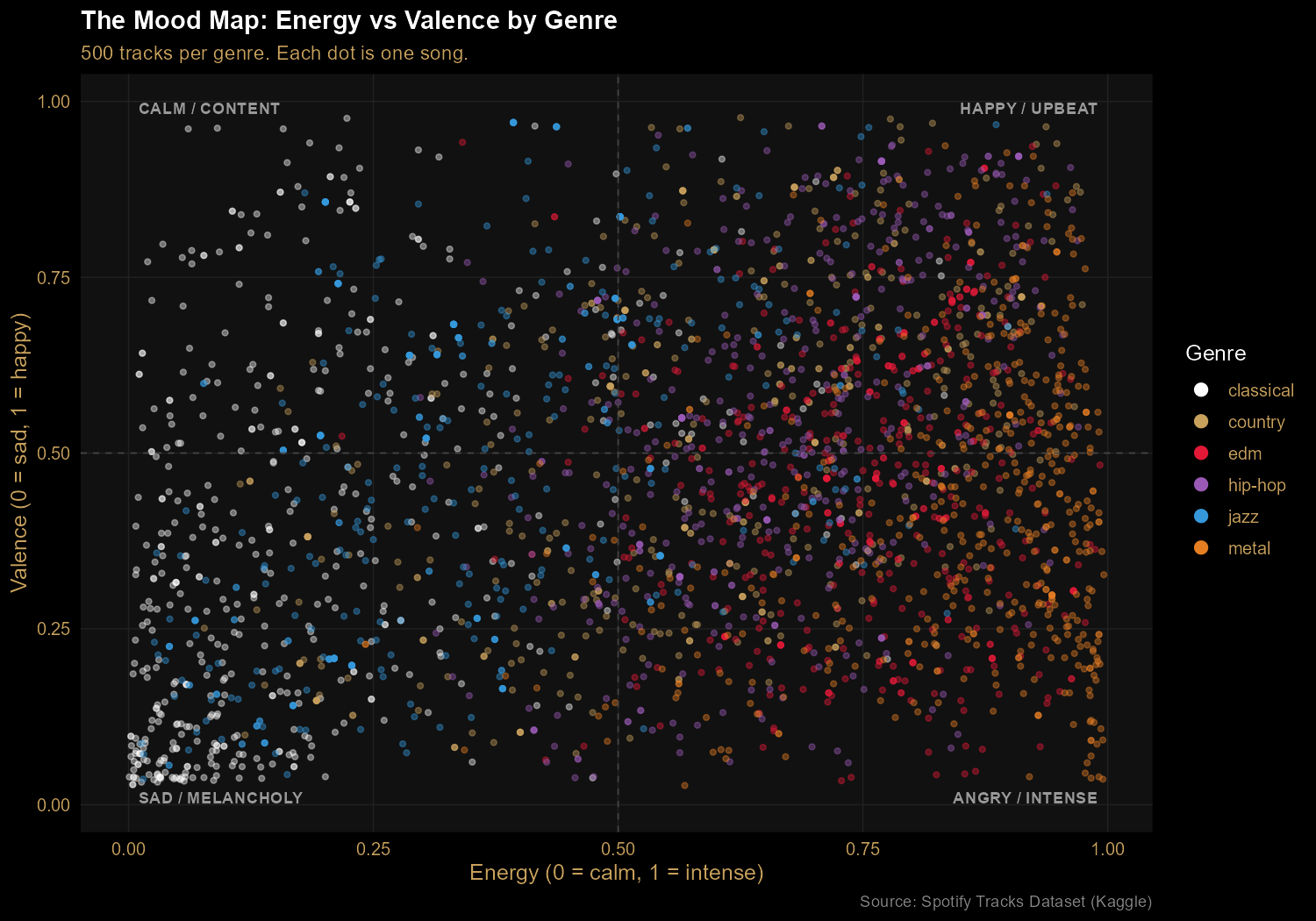
Finding 2: The Mood Map separates genres by energy and emotion
Plotting energy against valence (musical positivity) reveals four mood
quadrants. Classical clusters in the calm/melancholy bottom-left. Metal lives on
the right side (high energy), spanning both happy and angry valences. EDM tilts
toward upbeat. Hip-hop spreads across the entire valence range — the most
emotionally diverse genre in the sample. Every dot is a real track; every cluster
is a genre's emotional signature.
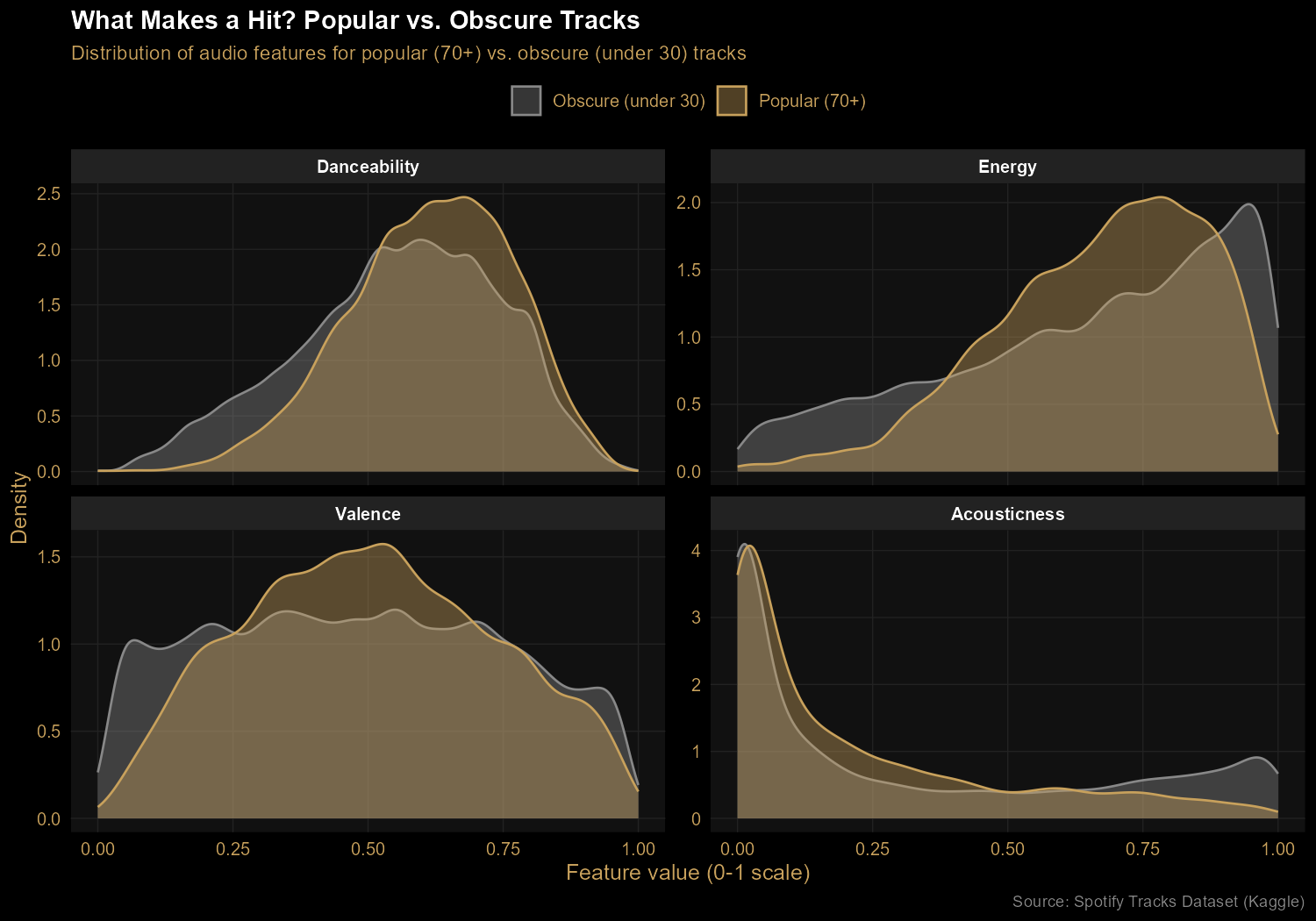
Finding 3: Hits favor energy and movement, not happiness
Comparing popular tracks (popularity 70+) against obscure ones (under 30)
reveals real but modest patterns. Hits skew toward higher energy and slightly
higher danceability. Acoustic tracks are rare among hits — pure acoustic music
doesn't dominate Spotify charts. The biggest surprise: valence (positivity)
shows almost no difference between popular and obscure tracks. People
listen to all moods at all popularity levels. The idea that "happy songs sell"
turns out to be wrong, at least in this data.
The Code
The first half of the work is data preparation. With the tidyverse pipe
operator (|>), the transformations read like English — take the data,
filter to selected genres, group, summarize, then reshape:
Then ggplot2 builds the chart layer by layer. Each + adds one piece — the geometry, the color scale, the labels, the theme. It's a more declarative approach than matplotlib's procedural style:
ggplot(chart1_data, aes(x = track_genre, y = value, fill = feature)) +
  geom_col(position = "dodge", width = 0.8) +
  scale_fill_manual(values = c(
    "Danceability" = "#C8A15C",
    "Energy"       = "#E31837",
    "Valence"      = "#FFFFFF",
    "Acousticness" = "#888888"
  )) +
  labs(
    title = "Genre Fingerprints: How 6 Genres Sound, by the Numbers",
    subtitle = "Average audio feature values across 1,000 tracks per genre",
    y = "Average value (0-1 scale)"
  ) +
  theme_minimal(base_size = 12)
Takeaways
This project leaned into R's two biggest strengths: expressive data
manipulation with the tidyverse and polished visualizations with ggplot2.
Compared to the equivalent matplotlib work in my cinema
project, ggplot2 produces noticeably more refined charts with less code — and
faceting (splitting one chart into multiple panels) is a single line in R rather
than a manual loop. Each tool has its strengths; doing this second project in R
let me feel them firsthand.
Analyzing 1,000 top-rated films from a public IMDb dataset to surface
trends in runtime, recency bias, and directorial consistency.
Overview
Using a public Kaggle dataset of IMDb's top 1,000 films, I built
a small end-to-end data pipeline: cleaning the raw CSV with Python,
loading it into a SQLite database, writing SQL to surface insights,
and visualizing the findings with matplotlib. Three findings stood out.
Tools: Python (pandas, sqlite, matplotlib), SQL
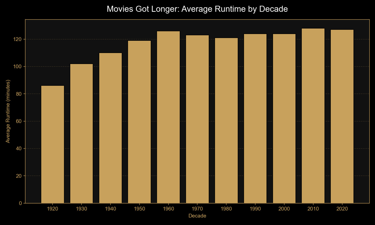
Finding 1: Movies have gotten dramatically longer
Average runtime climbed from 86 minutes in the 1920s to 128 minutes in the
2010s — a 50% increase over a century. The biggest jump came between the
silent era (1920s) and the studio era (1930s–1950s), once sound and
longer-form storytelling became the norm. Modern epics and franchise films
have kept runtimes near the two-hour mark.
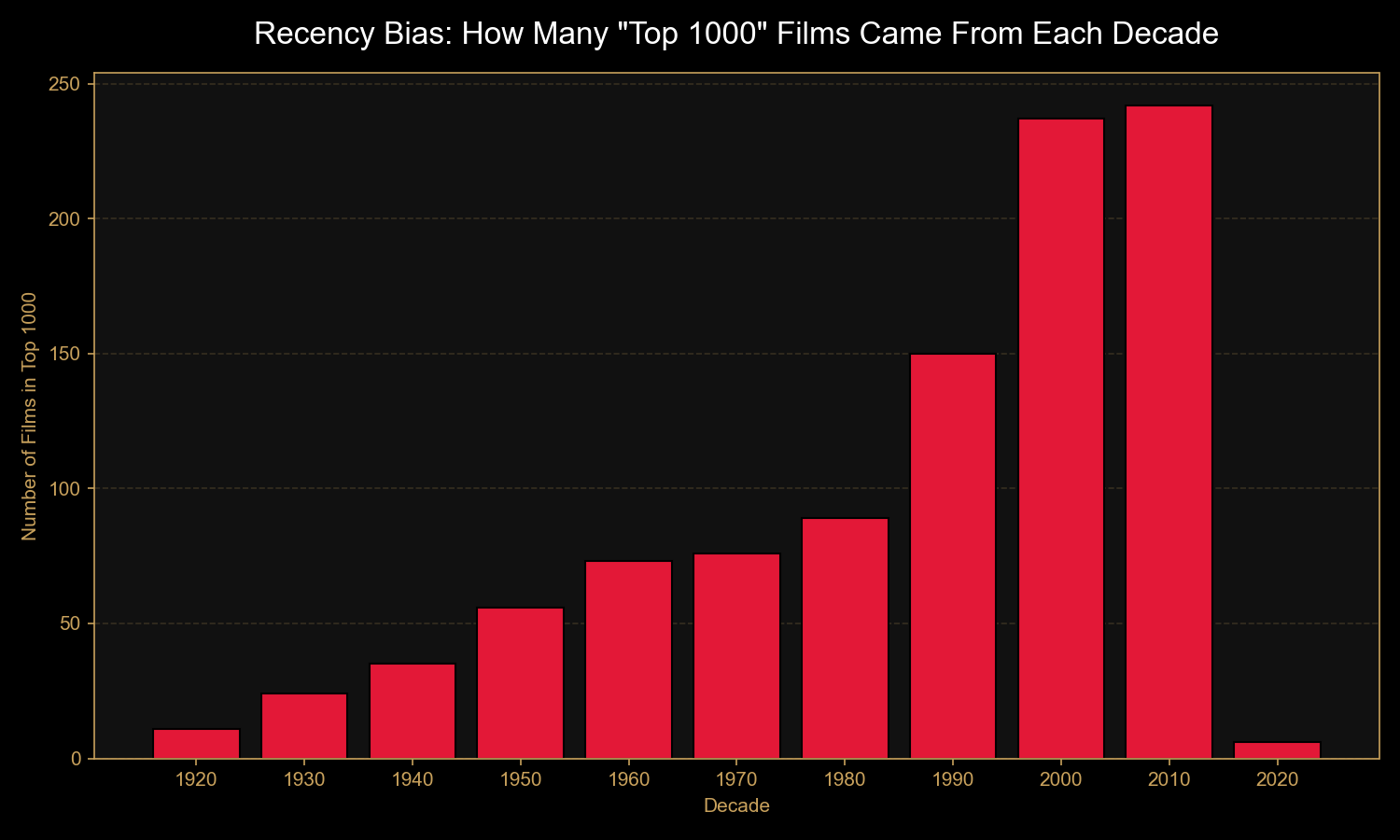
Finding 2: "Best of" lists have a strong recency bias
Just 11 films from the 1920s made the top 1,000 — versus 242 from the 2010s.
Yet the average rating barely shifts across decades (8.13 in the 1920s vs.
7.92 in the 2010s). The takeaway: "best of all time" lists reflect
who's voting now as much as objective film quality. (Note: 2020s
data only includes films through 2020, hence the small bar.)
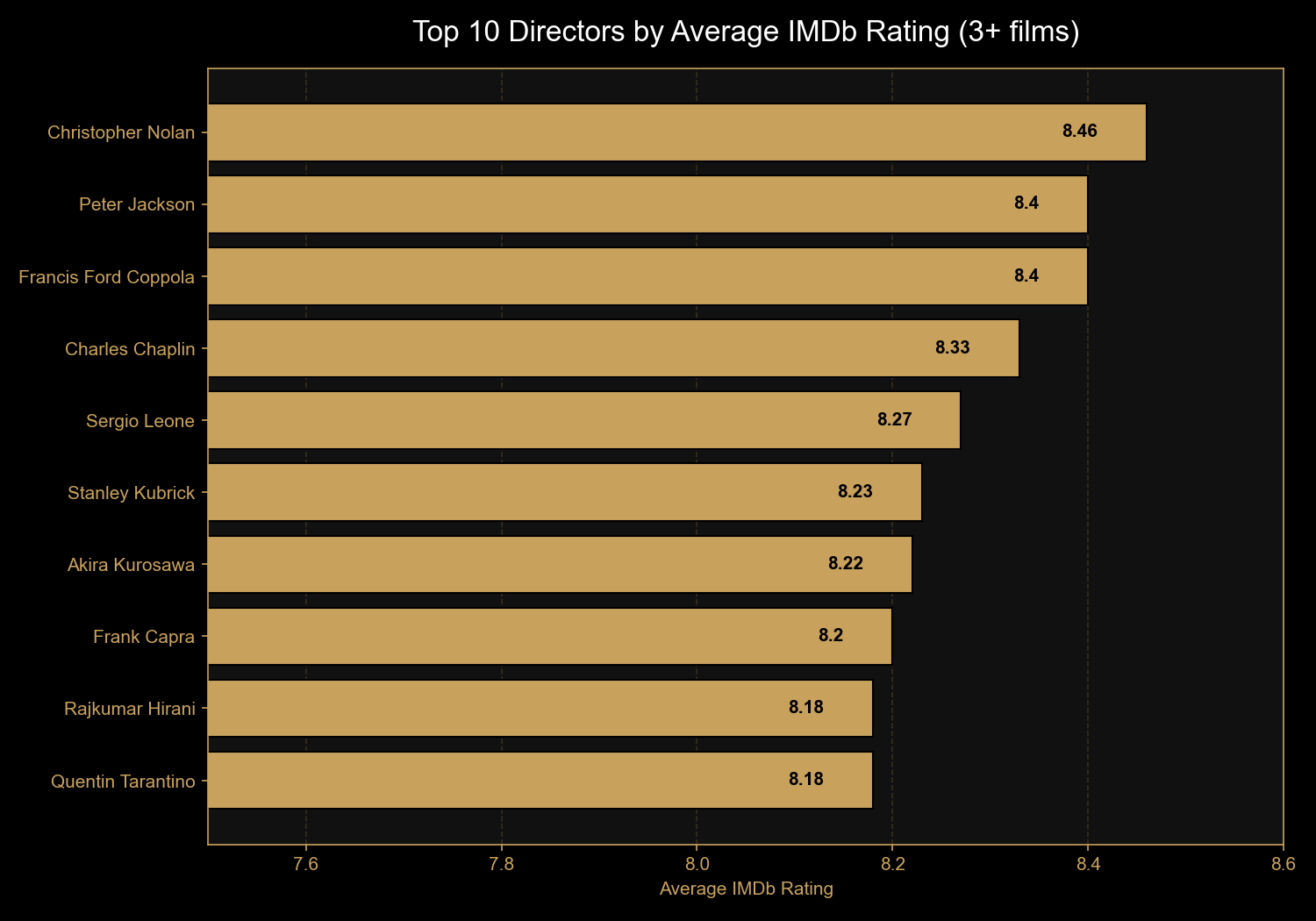
Finding 3: Christopher Nolan is modern cinema's most consistent director
Of directors with at least three films in the top 1,000, Christopher Nolan
leads with an 8.46 average across eight films — well above the dataset's
overall average of 7.95. Behind him: Peter Jackson and Francis Ford Coppola
tied at 8.40. Notable for sheer volume of acclaimed work: Akira Kurosawa
with 10 films in the list.
The Code
The pipeline runs in three steps. First, cleaning the raw data - IMDb's
Runtime, Released_Year, and Gross
columns all come in as text and need to be coerced into proper numeric
types:
import pandas as pd
import sqlite3

df = pd.read_csv('imdb_top_1000.csv')

# Strip " min" suffix and convert to integer
df['Runtime'] = df['Runtime'].str.replace(' min', '').astype(int)

# Coerce year to numeric (blanks become NaN)
df['Released_Year'] = pd.to_numeric(df['Released_Year'], errors='coerce')

# Strip commas from gross figures and coerce to numeric
df['Gross'] = df['Gross'].str.replace(',', '')
df['Gross'] = pd.to_numeric(df['Gross'], errors='coerce')

# Save to SQLite for querying
conn = sqlite3.connect('movies.db')
df.to_sql('movies', conn, if_exists='replace', index=False)
conn.close()
Then the SQL - bucketing films into decades and aggregating ratings,
runtime, and counts:
SELECT (CAST(Released_Year AS INTEGER) / 10) * 10 AS decade,
      COUNT(*) AS movie_count,
      ROUND(AVG(IMDB_Rating), 2) AS avg_rating,
      ROUND(AVG(Runtime), 0) AS avg_runtime_min
FROM movies
WHERE Released_Year IS NOT NULL
GROUP BY decade
ORDER BY decade;
And for the top directors finding, a HAVING clause filters out
directors with fewer than three films, so the list reflects consistency
across a body of work rather than one-off masterpieces:
SELECT Director,
      COUNT(*) AS movie_count,
      ROUND(AVG(IMDB_Rating), 2) AS avg_rating
FROM movies
GROUP BY Director
HAVING COUNT(*) >= 3
ORDER BY avg_rating DESC
LIMIT 10;
Takeaways
This was a small project, but it touched every stage of a real data
workflow: ingestion, cleaning, storage, querying, visualization, and
communication. The most valuable lesson wasn't technical - it was that
data verification matters before analysis matters.
Spotting the recency bias before drawing conclusions about
"decline in cinema quality" is the difference between a real insight
and a misleading one.